Search powered by Funnelback
Great search experiences are effortless. Within a few keystrokes, the search engine has an almost telepathic understanding of what you're looking for, and it can delight when it exceeds expectations.
We're so used to great search experiences we expect every search interaction to be the same.
However, outside of the behemoth all-of-web search (with an inexhaustible reach of databases to draw relevant data from) and multinational conglomerates, search is an afterthought.
And this is a worry as people are bad at searching. They don’t always know what they’re looking for, are looking in the wrong place or most often using keywords that don’t match your content (think product name of your competitor).
This issue is compounded for site search when the accepted user experience is similar to that seen on the web from fifteen years ago, with little thought to how it impacts interactions or accessibility.
This is a missed opportunity because the research is clear: poor search experiences lead to disappointment, website abandonment and ultimately lost revenue.
43% of site visitors give up after just one attempt to use the site search (Neilson Norman Group Research)
Capitalizing on search makes sound business sense. Users who search exhibit more intent and as a consequence, are more likely to convert. Like this statistic from the banking sector:
When properly designed and executed, site search can decrease bounce rates by an average of 95% and increase engagement rates by as much as 300%.
Why is search overlooked?
The reason for poor experiences is two-fold: technological inertia and human error.
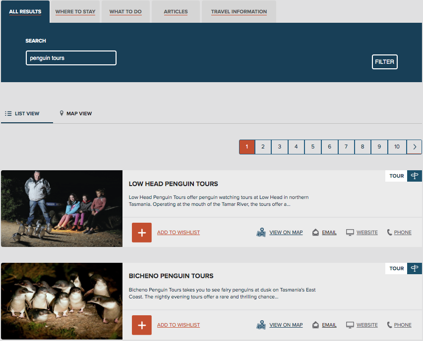
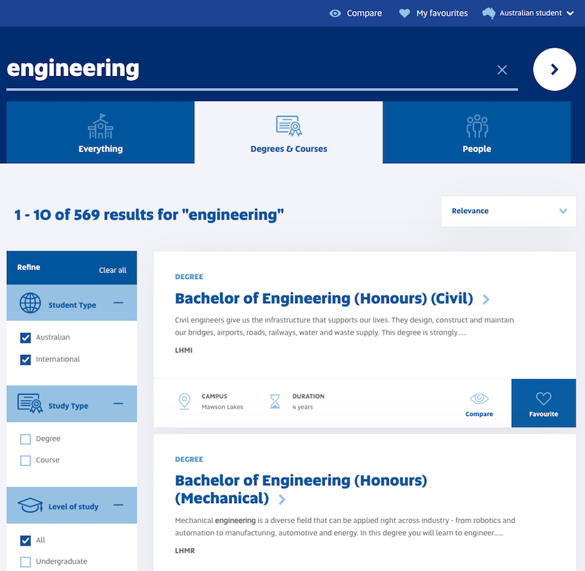
A search engine has to present information that is intuitive to the user. A list of ten blue web links with ambiguous or incomplete descriptions will do nothing to communicate the correct path. Search should be as much a visual experience as a landing page or homepage.

Deriving intent
For all the talk of natural language searching, only 8% of searches are written as questions. The search engine is still going to have to interact with 2-3 keywords and infer intent from those words.
With such a small number of keywords, an onsite search engine has to infer the intent of the user and present information that's most relevant. For anonymous web visitors, this poses a real challenge.
In Universal Principles of Design, The Five Hat Racks analogy refers to five ways in which information can be organized: Category, Alphabet, Time, Location, Continuum.
The design of a search engine results page, from a university website to e-commerce, should utilize these principles to create a symbiosis between search and navigation. Especially when you have no personalization enabled.

Conclusion
The results can be significant. Switching from a simple search experience, a recent university customer saw a 48% reduction in search exits, with the time spent on site increasing 149%. For an information-heavy website, engagement is one of the critical drivers for conversions.
Search experiences have long moved on from ten blue links. Search should create a seamlessly engaging journey to discovery, intuitively guiding the searcher to their ultimate goal.
Thinking of upgrading? Download our Google Custom Search vs. Funnelback E-book to see the technical differentiators.


