Search powered by Funnelback
Searching is fundamental to nearly all digital interactions. In entertainment (Netflix, Spotify), information gathering (Google, online encyclopedias, media sites), and E-Commerce (Amazon, Walmart), a search bar is the go-to place on a homepage to navigate to the right content. Even social media makes use of advanced search for people, places, topics (hashtags), and events.
Search is fast, precise, and straight to the point. When it’s done right.
That’s why we’re not surprised that a growing number of users, about 43% as of 2019, go straight to the search bar to navigate through a site.
They’re often met with disappointment and frustration. Your homepage looks great, but something happens when it’s time to search. Branding goes out of the window, there is little regard for what content is relevant, and they can’t find the content they were looking for. It’s a UX nightmare.
If you’ve put effort into your IA and the look and feel of your website, why are you suddenly allowing nearly half of your digital audience to come across this atrocity?
What’s worse, it isn’t the format or color choice. It’s the ranking.
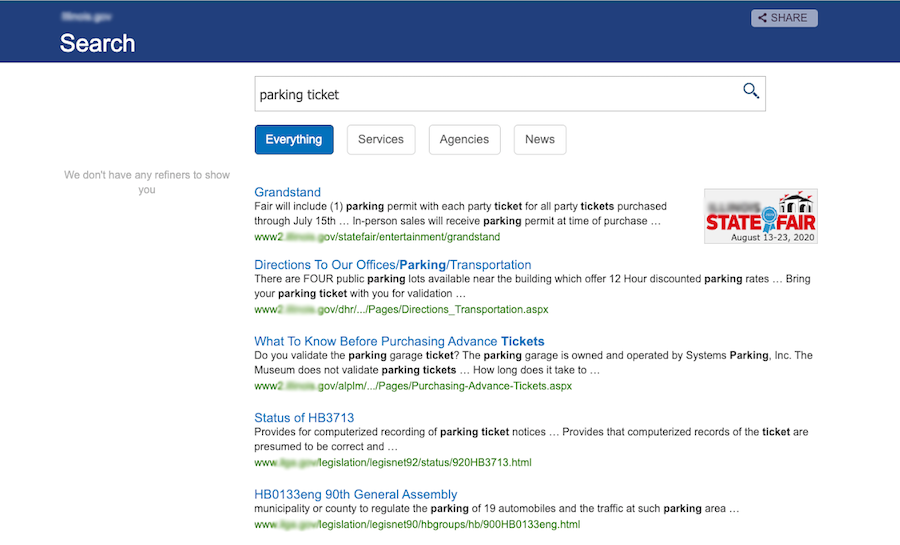
Here’s a live example from a state website that features the search bar prominently in the middle of their homepage. This user was trying to pay for a parking ticket.

It looks like she won’t be paying that today.
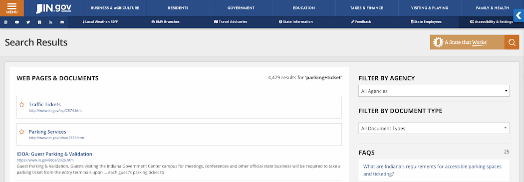
If she lived in Indiana, it’d be a lot easier.

How Indiana accomplished this: knowing that parking tickets were one of their popular search terms and a common online task, they made a curated result to appear at the top of their website search results page.
The takeaway from today? Growing online expectations mean that more people are searching, losing patience for technology that doesn’t help them accomplish their tasks.
Key Functions of Search
As search algorithms improve and people learn to trust search more, web teams and marketers have found value in the search bar. It’s about more than information retrieval. It’s about connecting the right content with the right people and having technology that is mutually beneficial for your users and your team.
What makes a great search?
- Navigation for a confusing IA
An easy path to convert. You know where things on your site are. (Maybe.) Directories and courses are kept separately from the sites, forms are not accessible from the search results, and social media is in a world of its own. Not with search. If someone recalls an event they saw on Instagram and wants more information, they should be able to search your site and find the post they remember, along with recommended content to give them more information.
- Analytics to derive intent and insight
Monitoring search terms and trends. People are actually telling you what they want to find, in plain language. This helps identify which web pages are popular, at which time. One university noticed a spike in searches related to dropping out over winter break. To combat this, they promoted results for financial aid, academic counseling, and resources for students at risk.
Data to inform content decisions. What pages are people finding? What are they not finding? Your decisions can be justified with quantitative metrics and you can measure real-time improvements on your site.
- Proactive UX
No dead ends. If a search on your site ends with a 404 page or a “have you tried searching ___ on google?” you’re likely to lose the visitor. Almost no one clicks to the second page of results and they shouldn't have to.
Advanced search functionality. Faceted navigation, autocomplete, and promoted results are part of a standard search process.
If you don’t have the ability to promote results, customize the look and feel of your search results page or get back-end insights, the experience on your site is not cutting it for your users. Search should drive organizational goals instead of inhibiting them. You can’t afford a sub-par search.


