Search powered by Funnelback
With the average school waiting five years between redesigns, there’s much to be done in the meantime. (Five years is appallingly long, in most cases, given that the website is your top marketing tool – but that’s a blog for a different day.) Modern marketing teams can’t wait half a decade to meet with an agency and make changes. Creating a culture of continuous improvement within your team is vital to meet the growing expectations of digital properties.
What should you consider in-between redesigns? Here are a few ideas to help you make impactful changes on your site in the meantime.
Setting the stage for success
When users complain about a website’s old content such as confusing navigation, poor usability, or other UX failures, you listen. You decide they must be improved, and pocket it away for the next redesign. But what if we took these good ideas and turned them into action?
It’s a full team effort. Developers or marketers alone cannot diagnose the problems of the website. A single individual or a few people in the same role will be unprepared for a project of this scope without cross-functional expertise, leadership direction and advocacy.
If it was up to designers alone, you might end up with a beautiful site that falls flat in functionality. If it was up to the developers, you might be lacking the marketing slant that makes your institution stand out. You need both. You need collaboration to diagnose the problem and decide on the most impactful solutions. Sometimes, the answer isn’t fancier tools and technology. You don’t want to improve the UX by accident. You want to go in with a plan.
There are things that people care about a lot more than others
Here’s the good news: in-between redesigns, you have the opportunity to tune your site and get the heart of the issues that cause you to think you needed a redesign in the first place. Small, simple fixes to the right elements of your site can accomplish more than you thought. And a lot of them aren’t that hard. When you focus on what matters most on your site, you get more bang for your buck (and time).
Here’s the proof: in this chart, we see that this data follows what we like to call a “long-tail” curve. In other words, a lot of people search for the same things. A chart of all the search terms would contain data like this:
| Query’s rank | % of search traffic | Query’s frequency | Query |
| 1 | 1.6% | 8,212 | campus map |
| 2 | 1.4% | 7,208 | housing |
| 3 | 1.1% | 5,645 | application |
| 38 | .08% | 446 | career centre |
| 341 | .007% | 36 | math placement test |
Here, thousands of queries are being searched on the website, but the frequency drops significantly after about the first 60 queries. The first 20 queries cover over 15% of the entire search traffic. A significant mass, if you consider the thousands of queries in total. The top 50 is over 23%, and so on. To cover 100% of all the search traffic, you’d have to optimize thousands of queries.
But to start improving your website’s content, focus on what people are looking for and the pathways they’re taking to get there.
Test and improve search performance.
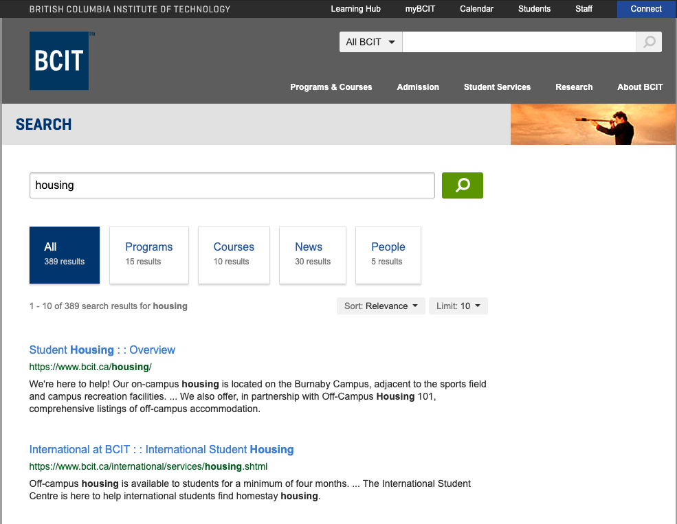
Start with the top 30 terms, if you can. With these high-volume queries, a little effort goes a long way. Does a popular page deserve a spot on the homepage? Does a different CTA need to move below the fold? Search “housing”. Does the right result appear at the top? Is the content outdated, duplicated, mistagged, or is there some other problem?
 This long-tail rule can be applied to almost all of your web content. We’re willing to bet that less than 20% of your pages are doing more than 80% of the work. The other 80% of pages don't provide the same value for the majority of visitors. A few pages are your bread and butter. The rest is simply dessert.
We know that dessert is good, and dare we say, necessary at times. But you can tackle optimizing the “dessert” content in your next redesign. Realistic changes to your website are most important for your heaviest trafficked pages and pathways. There’s a reason the landscaping looks the best along the main campus thoroughfares, where students walk every day, tours go by, and alumni meet. The same principle applies to your website. When you’re not changing everything, you can use data to prioritize efforts to tune and improve the website’s content, functionality and navigation – data is hard to argue with. And once you get everyone on advocating for continuous tuning of the site, it’s easier to decide which tools, agencies or services you may want to seek out.
Improvement starts (and ends) with data
Practice a culture of meaningful reporting and analytics. Site search data is a good place to start. So are traffic, audience demographics and website features. Data for the sake of data is no fun. For our full post on how to make your web teams data-driven, check out our blog here.
This blog was also posted in collaboration with Canada’s College & University Digital Marketing Conference, PSEWEB, on pseweb.ca.


