Search powered by Funnelback
In an ocean of information, we must find a way to organize our content. Users only read about 20% of a webpage, so you can’t possibly include everything on one page. Even if your page is full of useful information, the right navigation guides users to the information they are looking for within a few clicks.
A home page, as your #1 marketing tool, is extremely important. It should have updated content, links to other platforms, and intuitive navigation. Often overlooked by internal staff who already know where to look for digital content, the search bar is used most by new visitors. If it proves useful, the search bar becomes a trusted navigation tool that delights new and returning users alike with a frictionless experience.
Alexa, I know what I want!
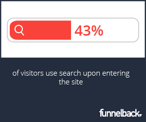
 The way people are using the web is changing. Increasingly, users are coming to your website with a particular objective in mind. Voice search has taken advantage of this trend with increasing velocity, and your site should do the same. Users are not online to surf the web or browse your content aimlessly. (If promoted in the right way, they may be persuaded to stay, but that’s not generally what brought them in the door.) They want specific answers, and they want it now. This trend isn’t going anywhere. It also explains why 43% of visitors use the search bar immediately upon entering the site.
In Search We Trust.
Haven’t we all found ourselves getting lost in pages, distracted and eventually forgetting what we came for because of an unsuccessful initial search? Trying to shop for an affordable ceramic bowl, but next thing you know you’re watching unrelated cat videos on the company’s twitter page... And that’s the best-case scenario. The plethora of information available on the web can be overwhelming at times.
Thankfully, marketers and web teams have the power to provide value to the user with intuitive and effective navigational tools. The right navigation is foundational to improving your websites UX so end users don’t waste time with frustrating, dead-end results.
Navigation with Form and Function
There are several essential elements to great UX, but findability is undoubtedly the backbone of a successful website. This means that each visitor can find exactly what they need quickly and effortlessly. After all, it’s easy to exit in just a click of the mouse. Because every piece of content simply cannot have prominent real estate on the home page, it’s imperative that menus and search are optimized. Within a glance at the navigation menu, if the content is still not explicitly available to the user’s eye, where do users turn? Search.
After making a query, the most relevant information should be the first result every time. There should be related results populated for that user. The most common reason for a visitor to leave the site is if they don’t get what they expect.
Give the people what they want! (or, at least, help them find it.)
Each user wants a simple and clean experience without having to deal with the confusing distractions. Virtually all internet users look for navigational tools when we can’t immediately find what we want. It's your turn to create delightful experiences that contribute to the real goals of your site.


