Search powered by Funnelback
Beloit College’s Mindset List notes that students in the class of 2020 never had to watch or listen to programs at a scheduled time, and they have always purchased airline tickets online. There is no magic to mobile internet for Gen Z: instead, it is an ever-present resource, friend, dictionary, storefront, television and recruiter.
With that wealth of information and access comes a demand for personalization. How else to sort through reams of data than with sophisticated AI, algorithms and highly targeted landing pages? For many colleges, this challenge has resulted in a complicated mess of pages and sites.
Are you creating a digital experience worth talking about?
You’ve built the landing pages for prospects and donors. Students can register for courses and learn about campus events on separate pages, and faculty have a section, as do alumni, clubs, parents and community relations.
Author and entrepreneur Seth Godin challenges us to create “experiences worth talking about” on the web. Is your institution succeeding in creating these experiences to meet the exacting demands of Gen Z and your other audiences? Is it resonating? The challenge of reaching each audience in a compelling way is often overwhelming, especially in the challenging mobile context.
Gen Z is hyper-mobile
Gen Z is even more mobile-centric than their predecessors. Where millennials are hesitant to make a purchase using their mobile phone, Gen Z are already leveraging their phones to make – and act – on decisions.
"Higher education organizations need to be where Gen Z has their attention," notes Ruvim Achapovskiy of Gen Z-focused Social Bomb. "Trying to reach today's teenager through a flier or a teacher isn't going to cut it. You need to speak their language. That means taking your marketing budget from printing fliers and relying on teachers and instead using those funds to create interesting, relevant, and eye catching content that can be distributed digitally and through social media."
And most mobile users across generations are ready to make purchase decisions. A Google study found that three-quarters of mobile searches triggered follow-up actions, and more than half triggered conversions. Some 70% of mobile searches result in action within one hour. Among Gen Z, an astounding 53% report that they use their mobile devices to make online purchases regularly.
Move from mobile-friendly to mobile-first design to reach Gen Z
The majority of our digital consumption now takes place on mobile (53% mobile compared to 42% for desktop). For a growing number of consumers, mobile devices are the only device they use to access the web. In 2014, a staggering 97% of prospective students viewed post-secondary websites on their mobile devices.
Yet websites are too often built desktop-first, with designers asked to ensure that the final product is “mobile-friendly”. As a result, websites provide overwhelming information in a mobile-friendly format.
With mobile-first design, there are no unnecessary elements and reduced navigational confusion. Stripped bare, a mobile-first approach demands a distilled user experience. And a simple way to navigate to specific content quickly.
Align marketing and IT around mobile priorities
Looking for a quick win that will impact key IT and marketing KPIs like student acquisition, retention and donors? At a time of falling registration and increasing competition, a major project like a website redesign can fall to the bottom of the long list of priorities.
Thankfully, mobile search can be implemented on-the-fly and integrated directly into existing infrastructure. The impact on your users will be immediate and lasting.
With sophisticated filtering and segmentation, you can even target out-of-state and international prospects, current students, and other groups likely to need specific information quickly. And existing students can navigate courses and events even more efficiently, ensuring greater student and faculty satisfaction with the site.
Navigating complex information quickly
Mobile-first design must acknowledge the inherent limitations of small screen navigation. The simplest solution? Effective mobile site search.
If mobile site search doesn’t quickly yield the result they desire, consumers abandon the site altogether. High performance mobile search bridges the gap between visitors and the content they seek.
Best-in-class examples
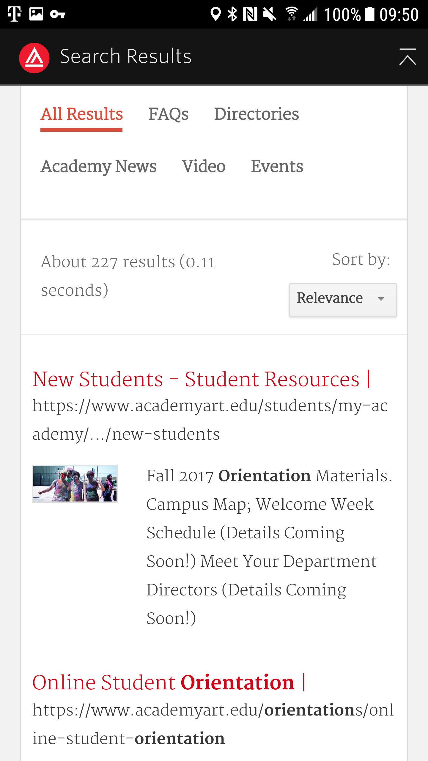
Academy of Art University in San Francisco
Search includes several sections, including FAQ to ensure that students can quickly discover how, for example, they can attend an orientation session.
A separate section searches people, news, videos, and events - common search categories. A quick analysis of most common search terms and most-clicked results is invaluable in determining what segmentation might be most useful for your institution.

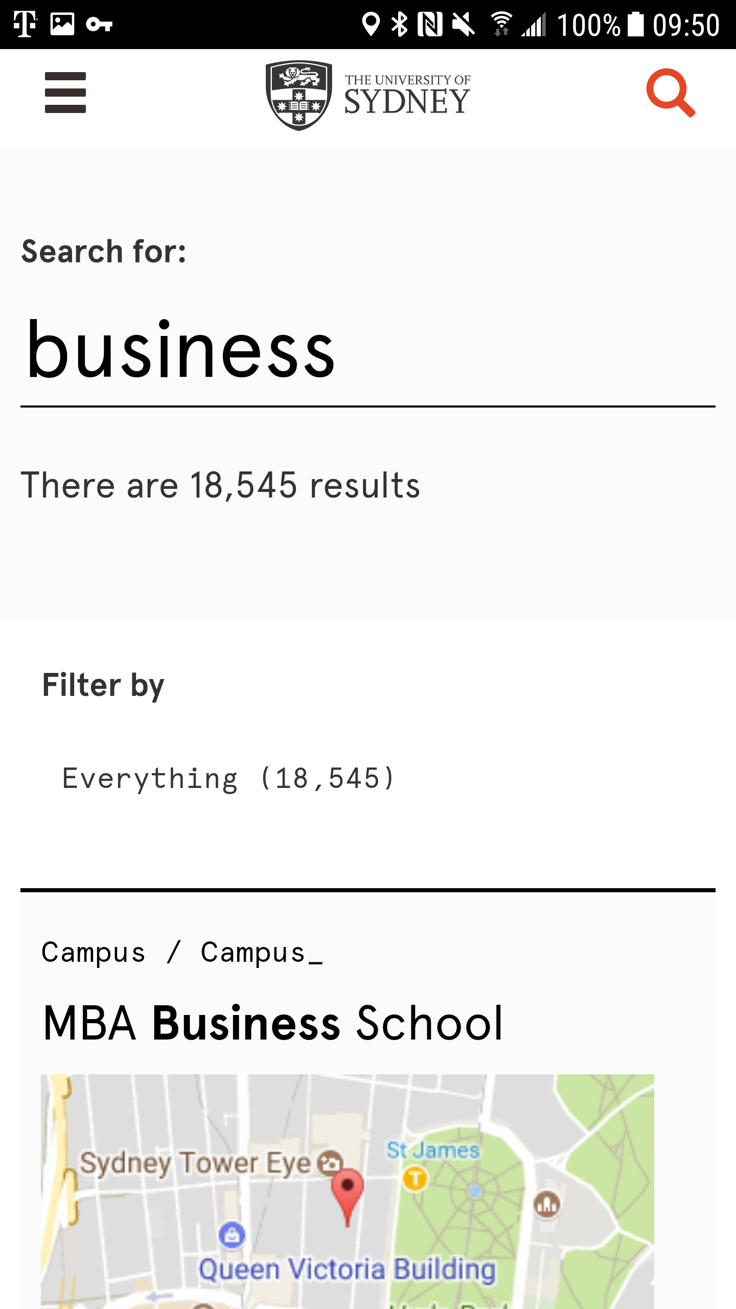
University of Sydney
Search has been customized so that new students or visitors can quickly look up the location of any building on campus.
Search can also consider whether site visitors have been on campus, or on the site, multiple times. If they already know their way around, they may be shown other priority results once they are established on campus - for example, a search for Business from a regular visitor might promote transfer opportunities or events focused on the business school.

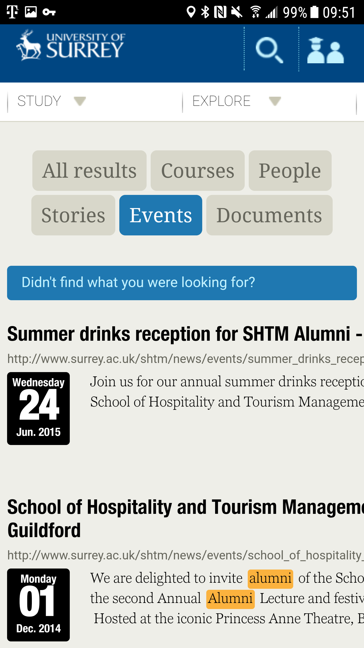
University of Surrey
Search has been customized to prioritize events. Not just for students, this search connects alumni with relevant events in a hurry, building fundraising and engagement capacity without expensive landing pages.

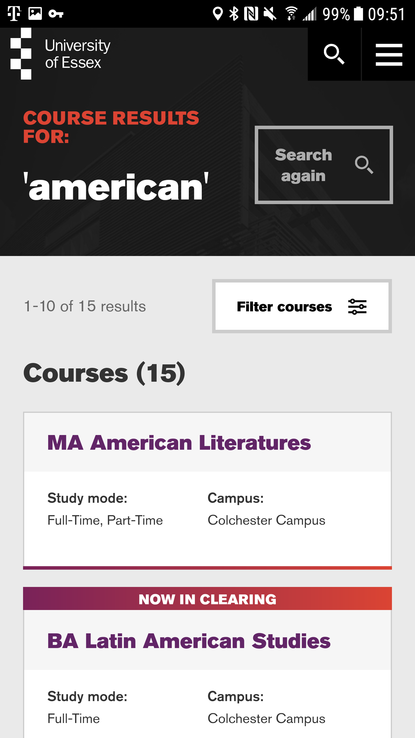
University of Essex
Students can easily filter courses by location, opening, state, mode, subject or level. The search results are therefore highly targeted, relevant and instant access to exactly what the visitor needs.


