Search powered by Funnelback
The Organization
Building on over 85 years’ experience in training and education, Federation Training provides improved opportunities and outcomes for vocational education students across Gippsland and South Eastern Victoria.
With 10 campuses from Chadstone in Melbourne’s outer East across the state to Lakes Entrance, Federation Training offers a diverse range of programs and specially designed learning environments, providing students with the opportunity to get hands-on and develop real skills and experience in the industry of their choice.
Key Project Objectives
-
Intuitive course search
-
Functional UX and design
-
Responsive mobile layout
The Situation
Whilst Federation Training’s previous website was on-trend at the time of launch, the 8 years that had passed had aged the site into an out-dated and difficult to navigate experience. When the opportunity came, the team jumped right on board the redesign project with the goal to create a better experience for their customers.
With an understanding that their ‘product’ is courses, the organization talked the talk about course modernisation and industry expert trainers. But the website told a different story with a basic search interface that often would not return anything relating to the search term. The layout and formatting was ugly, and the site was not responsive at all.
The Federation Training project team proposed the following vision statement for their new website: “Our website will provide students with detailed course and services information so they can make better, informed decisions on their course of choice.”
The Solution
Federation Training valued the concept that in a vocational education environment, driving conversions in the form of online enrolment enquiries needs to be a key objective. A course finder shines as the focus of the search experience, providing current and prospective students with all the information they need to make informed decisions.
Federation Training customised what was a standard search with 10 links and elevated it to something that could truly meet the needs of their customers. Front and center of their business objectives was easy course browsing and efficient discovery of the right course.
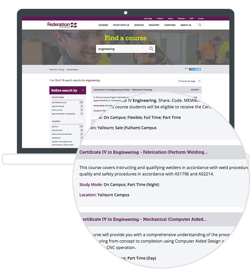
The search results themselves balance their detailed summaries with consistent information about the course. Course name, code, summary, study mode and location allow a comprehensive overview without needing to click through to the result page, and at the same time avoid confusing the user with too much information. The size and placement of components to allow the user to focus on the most important content and tasks is also key to this simplicity.
-
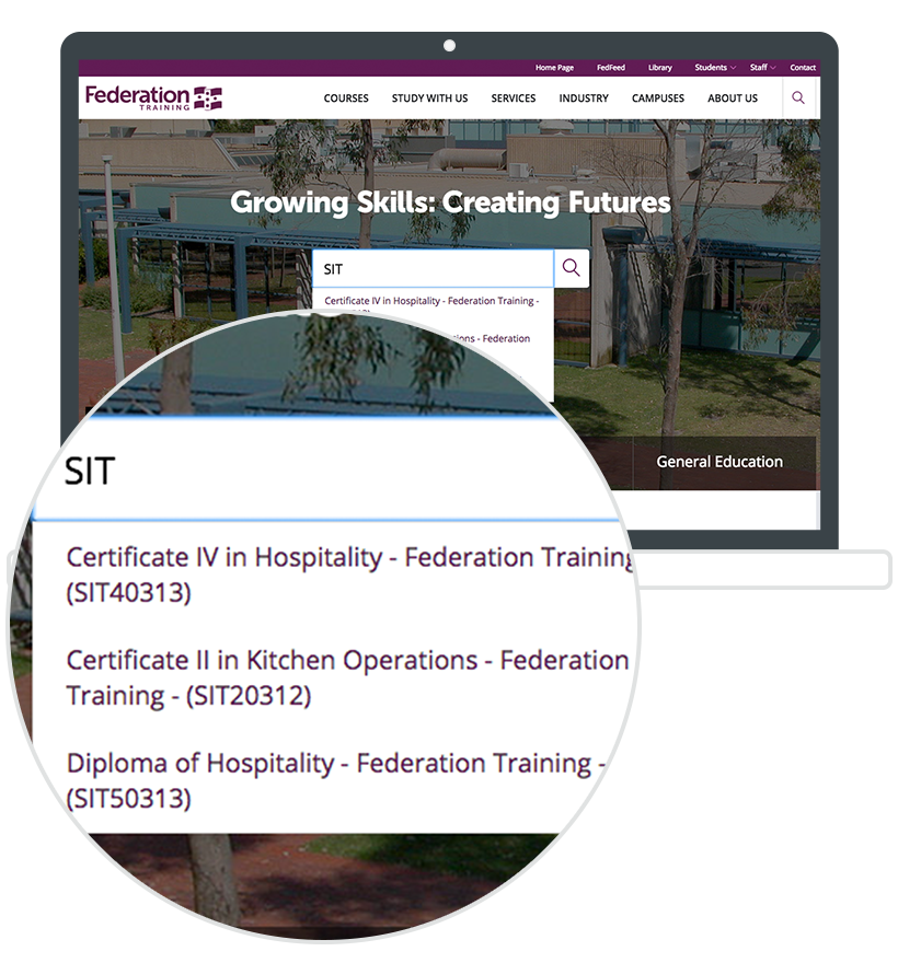
Enhanced auto-completion
In order to facilitate quick and easy access to course information for staff as well as students, the auto-completion has been supercharged to make searching courses by course code as effective as by course name.
-
Custom results
Only enough information is displayed for the user to be able to decide whether this is the course they are looking for or interested in reading more about.
-
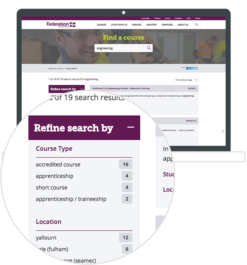
Custom navigation
Faceted navigation filters have been limited to only items that users need to focus on to generate the best result for them.


The key to the search's success was in the search User Interface design focusing only on the essential information and not overwhelming the user.
Lacey Yeomans Federation Training
The Result
The Federation Training course search is eye-catching with its strategic placement on the homepage of the website. It places the organization's bread and butter - courses - front and center of their online presence. With such a focus on courses, the use of search to navigate the website has more than doubled since implementation. Last year Federation Training's old course search recorded around 50,000 page views during a 6 month period compared to this year's 130,000+ page views during the same period.

View More Projects
Don’t just take it from us.


